Welcome to this week's CASE-ing the Catty
This week the challenge is all about using both Sale-A-Bration and Occasions product in your project. I have CASE'd the project from the front cover of the Sale-A-Bration catalogue.
CASE stands for Copy and Share Everything. This whole challenge blog is about using the current Stampin' Up! Catalogues to help you create. Sometimes crafters need a springboard to just get started and the catalogues are certainly a demonstrator or customer's best resource.
Most importantly, have FUN!
Guidelines -
- Create a new project for the current challenge.
- Mention CTC Challenges in your blog post and link back here so others can join in on the fun. Please ensure that you link up your blog post, not your whole blog.
- Mostly SUO (Stampin' Up! ® Only) products (retired or current) to be used in your projects for CTC Challenges.
- Have fun and inspire others!
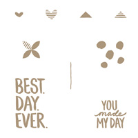
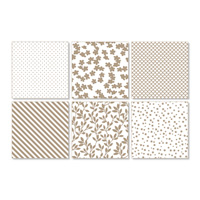
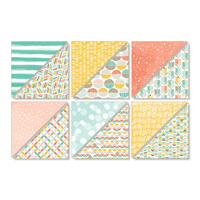
On my card, I used the Irresistibly Yours DSP (SAB), the Best Day Ever stamp set (SAB), a teeny strip of the Best Year Ever DSP (SAB), and the banners and starbursts from Celebrate Today (Occasions catalogue). The clip is from a retired set of hardware clips, but a metallic silver clothespin would give the same effect. :)
I used a toothpick as the handle of my little banner flag. :)
Here's the original inspiration:
I used a toothpick as the handle of my little banner flag. :)
Here's the original inspiration:
I hope you like my card. If you have been inspired by it and would like to support my creative business, all the supplies may be found by clicking through the links below which will take you to my store.
The 2015 Occasions Catalogue and the Sale-A-Bration catalogue are OUT NOW so if you would like to go on my mailing list and receive your free copy, just send me an email. :)
Cheers
Visit my online store for Stampin' Up! supplies.
Are you one of my 15,000+ Pinterest followers?






Love your combo of stamps. Such a festive card.
ReplyDeleteVery pretty Alison, I have to say, just between you and me though, I like yours better than the original! ( it just doesn't seem as cluttered)
ReplyDeleteI love your card, Alison! Your choice of images, layers & colours is beautifully balanced. I'm with Rachel, definitely like yours better than the original. ;)
ReplyDelete