Hi
At CASE-ing the Catty this week, we are exploring the Wedding chapter of the catalogue.
The idea is to feature a section of the Stampin' Up! ® catalogue each week using the projects in the catty as inspiration.
You can directly CASE (Copy and Share Everything) or use a sketch/layout, colour combo, embellishment, just to name a few examples, as a springboard for your own creations.
Here's a Badge to paste to your blog:
Guidelines
Here's a Badge to paste to your blog:
Guidelines
- Create a new project for the current challenge (no back linking)
- Mention CTC Challenges in your blog post and link back to the challenge blog so others can join in on the fun.
- Let us know what project you CASED and make reference to the page of your country's catalogue where you got your inspiration.
- SUO products (retired or current) may be used in your projects for CTC Challenges.
So let's go!
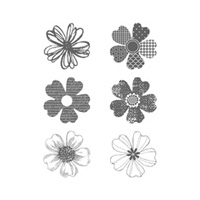
For my card, I was inspired by the wedding card on page 67 of the catalogue. I loved the layered flowers from Flower Shop and the cool script background of the Dictionary stamp.
I think it is funny how sometimes the first thing you reach for in your craft stash sets the tone for the whole card. I intended to do this card on a Soft Sky base just like the example in the catalogue, but I saw a square piece of Very Vanilla card stock sitting in my drawer and I grabbed it instead.
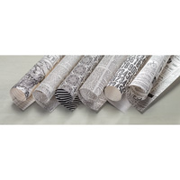
I don't have the Dictionary stamp set but I DO have the gorgeous new Typeset Specialty Designer Series Paper so I cut this down to size for my background. Before you say anything, yes, I have a thing about newsprint looking a certain way....my thing is this....if newsprint is around the correct way, then the eye is drawn to read the words....which isn't really why it is on a creative project. It is there to give a feel or an aesthetic, so I always turn my newsprint around the other way so you get the idea of newspaper or a vintage book but your eye isn't distracted by sentences about farming etc. :)
I hope you like my card. It is WAY more shabby chic and vintage than I am used to, but I do like the way this card has come out. :)
Cheers
Alison xx




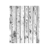





Great minds CASE alike Alison! LOVE your take on the sample card. From the card size to the colour combo, I love it all :)
ReplyDeleteLove your card Alison. The wood grain background is terrific, and you can't help but love those flowers.
ReplyDeleteA gorgeous CASE, Alison. I love that sketch in the catty. Great choice of colours and I think I like your version much better!
ReplyDelete