Pages

Saturday, April 28, 2012

Less is More #65 & UDI #85 - Stampin' Up! Designer Frames

Hi again

I'm on a roll today with the card challenges. It is a wet & dreary day here in Brisbane today so it's the perfect day to craft.

This card uses the sketch from Less is More and the colours from Utah Divas International


I tried to keep the sketch nice & clean and I decided not to include a sentiment....since it was textured cardstock I wasn't sure how it would stamp so I left it as is.

The colour challenge photo inspired me to use striped Daffodil Delight DSP and a polka dot flower. I think this card will end up in the letterbox of a certain "yellow-addicted" person for her birthday. :)

Hope you like my card! :)

Materials used:
Stamps - none
Cardstock - Whisper White (textured), Basic Black, Daffodil Delight DSP
Accessories - Flower Brad (Daffodil Delight), Basic Black 1/8" taffeta ribbon, misc polka dot flower
Tools - Paper Cutter, SNAIL, Dimensionals, Big Shot, Textured Impressions Embossing Folder - Designer Frames, Paper Snips. 

ColourQ Colour Challenge #134 - Stampin' Up! Medallion

Hi again

I have been wanting to create a card for a colour challenge for a while now and I saw this challenge over at ColourQ and thought I'd give it a go.


The colours looked really hard to work with when I first saw it but when I laid out the Bravo Burgundy, Calypso Coral & Pumpkin Pie next to one another.... they seemed to work....now just how to wrangle that Pool Party fellow......


To get this image, I took my Calypso Coral inkpad and used the edge of it to ink the centre of the pad, I made a little coverage of ink in the shape of a square, then rotated the stamp and did it again...this gave me an octagon type shape of ink over the centre of the medallion. I then got the pumpkin pie ink pad and, again using the edge of it, dragged ink from the edge of my Calypso Coral octagon towards the edge. The idea is to blend so don't worry if you start to lose the colour lines. I repeated all the way around the medallion stamp until it was covered to the edges in Pumpkin Pie. Using the Bravo Burgundy inkpad, I simply inked up the edges with the edge of the inkpad. After I had done this, I used a sponge and just lightly dabbed the area between the Pumpkin Pie & Bravo Burgundy....this helps to get that graduated blend of colour. 

To represent the 'Pool Party' I got one of Stampin' Up!'s lovely Antique Brads which has a slight verdigris finish anyway. To bring out the colour a bit more, I sponged Pool Party ink over the brad and used my Pool Party marker to fill in those little gaps. It doesn't quite show in the photo but it looks lovely!!     

I then layered my image onto Bravo Burgundy textured card stock and then onto Very Vanilla textured cardstock as the card base.

I would have NEVER chosen to use these colours if I was working to my own preferences, but that is the absolute beauty of colour challenges. They really do challenge you to think in different ways about your colours and how they 'work'. I encourage you to have a go....send me a link to your card or email me a photo! I'll put it on my blog for you. :)

Cheers & happy stampin'    
Alison xx

Materials used:
Stamp - Medallion
Cardstock - Very Vanilla, Bravo Burgundy
Ink - Calypso Coral, Pumpkin Pie, Bravo Burgundy, Pool Party
Accessories - Antique Brad
Tools - Paper Cutter, SNAIL, Mat Pack, Sponges, Stamp-a-majig

Wednesday, April 25, 2012

Stampin' Up! New Starter Kit for New Demos!

Hi everyone
I've just received some very exciting news from Stampin' Up! and I'm excited to report to you that beginning 1 May, Stampin' Up! are offering a fully customisable Starter Kit for new recruits at a new lower price of $169! This will give you the perfect start to your Stampin' Up! business


If you join Stampin' Up! from 1 May, the choice is yours to put together a kit with any of our current high-quality products....you can choose up to $235 worth of any Stampin' Up! products! ...and you will also receive a business supplies pack (valued at $80) to create a kit with a total value of $315.... AND it all ships for FREE direct to your home!


I think this is SO exciting.....I joined as a hobby demo in September last year during one of Stampin' Up!'s special recruitment promotions and I have enjoyed every minute of being a demonstrator. I joined up simply to get the 20% discount on all products and I've never looked back!! :) Some of my favourite things about being a demo are the sneak peaks and pre-orders on all the new stuff and the wonderful group of Stampin' Up! demos that I've had the pleasure to meet both in person and on the Stampin' Up! social networking pages. :)  


You can run your stamping business any way you like and I will give you all the help that you need....or no help at all if you'd prefer it that way. Stampin' Up! is a 'no-pressure' company...you don't even have to hold workshops if you'd prefer not to. The only obligation is to meet a quarterly commisionable sales minimum of $400 which is VERY easy to meet when you consider that, after you factor in your discount, it only works out to about $27 p/wk to be part of the Stampin' Up! family!!!


With the introduction of the this new Starter Kit on 1 May, new demonstrators will no longer have the option to purchase another kit or the add-ons. If you have always had your eye on the current kit option, you will need to get in touch with me to sign up by 30 April 2012, 11:50 PM (AEST).


You can sign up directly on my Stampin’ Up! website (just click on the 'Join Now' button on the top right hand side under my contact details) or if you want to have a chat first you can email me or phone me on 0413 405 139.  


Would love to have you on board my Stampin' Up! team !! :)

Tuesday, April 24, 2012

Less is More - Clean & Simple Thank You card

Hi!
I made this card for a fellow Stampin' Up! demonstrator who is the main administrator for the Facebook group that I belong to ... ESAD.....it's for Stampin' Up! demonstrators to exchange ideas and support each other. In fact, one of the most wonderful parts of being a Stampin' Up! demonstrator is the social networking side of it....it really is a lovely group of 'sisters'. :)

I won't put her name in yet as I want it to be a surprise....but come back in a week or so and I'll link her blog here. :)


This card was inspired by this week's challenge over at
Less is More. I am a big fan of the 'clean & simple' design genre so I thought I'd give this a go. The theme this week is 'charms' and although I'm yet to acquire some Stampin' Up! charms....and believe me there are some gorgeous ones in the catalogue, I found these lovely pewter flowers in my stash that I thought would look perfect against a vanilla & grey background. So while they aren't exactly 'charms' I hope that it still fits in the guidelines for this challenge. :)


A couple of tips when designing a 'CAS' card:
a) lots of clean white space (or in this case, vanilla space)
b) if you do layer the cardstock...use narrow layers....1/16 inch border is perfect.
c) use some textured cardstock....it gives the card a more commercial & 'expensive' feel.

I hope you like my card....and I hope L.S likes it too. :)

Materials used:
Stamps - So Happy For You (retired Sale-A-Bration 2011)
Ink - Basic Gray
Cardstock - Very Vanilla (textured & non-textured), Basic Gray
Accessories - misc flower charms
Tools - Paper Cutter, Simply Scored, Bone Folder, SNAIL, Multipurpose Liquid Glue, Dimensionals (for the textured CS layer).

Friday, April 20, 2012

Festive Friday #15 - Mother's Day Inspiration

Hi everyone

This week on
Nicole Derendorf’s Festive Friday Challenges, we are all about Mother's Day cards.
Firstly I don't know about you but I'm often stumped as to whether to type Mother's Day or Mothers' Day. According to a general knowledge page on the internet....

the correct spelling of the holiday is “Mother’s Day,” not “Mothers Day.” It is a day that belongs to just one mother – yours!


Here is the inspiration Nicole gave us to get our mojo flowing....or should I say 'flowering'. :)


When I looked at this I had grand plans of soft flowery images, maybe with some vellum & linen thread or twine....but it just wasn't coming together for me. I really wanted to keep the 'vase' feature but I moved away from my original idea and went with a more 'modern' card using a sketch pattern that is quite familiar to me. :)

Here it is....


I punched some Stampin' Up! Silver Glimmer Paper with the Scallop Oval Punch and trimmed the ends to make a vase. I then sponged it with Blushing Bride ink so that it matched the Twitterpated DSP base. The flower is made using one of the dies from the Bigz L Fun Flowers set, and a couple of images from Posy Punch punched with the Fancy Flower Punch and Boho Blossoms Punch. I just love how everything layers so perfectly!! The stem is some ribbon I had left over from my Lucky Limeade organdy ribbon from the recent Sale-A-Bration promotion.

Hope this inspires you to make your own Mother's Day card for your lovely Mum!!! If you want to place an order for any of the products used or if you'd like me to demonstrate a workshop with this card, just
email me or phone 0413 405 139.


Bye!


Materials used:
Stamps - Posy Punch (Hostess set), Teeny Tiny Sentiments
Ink - Rose Red, Lucky Limeade, Versamark, Blushing Bride
Cardstock - Whisper White, Rose Red, Twitterpated DSP, Lucky Limeade, Silver Glimmer Paper
Accessories - Lucky Limeade Organdy Ribbon (Sale-A-Bration 2012)
Tools - Big Shot, Sponge Daubers, Paper Cutter, Bigz L Fun Flowers, Fancy Flower Punch, Boho Blossoms Punch, Scallop Oval Punch (for vase), Decorative Label Punch (for sentiment), Paper Snips.

Friday, April 13, 2012

Stampin' Up! - Fox & Friends - CASE

Dear Everyone

Here is a card I made for my son's first birthday - it's a CASE of a STUNNING card by the extraordinary
Lisa Young.

btw...CASE means 'Copy & Share/Steal Everything'....which is card-maker speak for copying a card design by someone else....making minor adjustments but essentially it is someone elses idea...so it's always good "karma" to get permission and then link to the original card creator.

I asked if I could publish my version and she very generously said 'yes'...so please visit her blog and have a look at her original design and all the lovely accessories that she made to match it. She really is SO talented!!


Hope you like my version! :)

Materials used:
Stamps - Fox & Friends, So Happy For You
Ink - Daffodil Delight (inkpad + marker), Chocolate Chip, Tempting Turquoise (ink pad + marker)
Card - Tempting Turquoise CS, Chocolate Chip CS, Daffodil Delight CS, Whisper White CS, Play Date DSP.
Accessories - misc brads, Bakers Twine, Daffodil Delight 1/8 inch taffeta ribbon.
Tools - Big Shot, Finial Press Textured impressions Embossing Folder, Square Lattice Textured Impressions Embossing Folder, Perfect Polks Dots Textured Impressions Embossing Folder, Decorative Label Punch (trimmed down), Mat Pack, Glue Dot, Paper snips, SNAIL, Paper Cutter, Stampin' Dimensionals, Crop-a-dile (for sentiment hole punch).

Friday, April 6, 2012

Festive Fridays #13 - Christmas Colour Challenge - Snow Swirled Vintage

Hi Everyone

Here's my latest design for Nicole Derendorf’s Festive Friday Challenges. I'm usually not one to create vintage cards....it's not that I don't like them...I LOVE them, but I'm generally not that good at making them.

Here is the colour palette for our Christmas card this week....just the combo of Crumb Cake & Very Vanilla triggers the vintage feel for me I think....


...and here's my card....

Do you like it? Not bad for probably my 2nd vintage effort. :)

May I also take this opportunity to share a bit of a mistake with you. For some reason when I was preparing my design for this week's challenge, somehow 'Not Quite Navy' got stuck in my head instead of 'Island Indigo'...so I happily created this card without realising that my colours were wrong. **sigh**


Fortunately, it was easy to re-create with the correct colours for the challenge.....how I love Stampin' Up!!! :)

I actually like these cards so much, I might make a tonne of them for my swaps for Stampin' Up! Convention this year. We shall see..... :)

Happy Stampin'!
Cheers
Alison xx

Materials used:
Stamps - Snow Swirled, Sanded (retired)
Ink - Crumb Cake, Island Indigo, Pool Party (Not Quite Navy for card #2)
Cardstock - Very Vanilla, Crumb Cake, Island Indigo (Not Quite Navy for card #2)
Accessories - Pool Party Seam Binding Ribbon (from the new Autumn/Winter mini catalogue!), Vintage Brads.
Tools - Big Shot, Framed Tulips Embossing Folder, Stamping Sponges, Stamp-a-majig, SNAIL, Champagne Mist Shimmer Paint, Paper Cutter, Paper Snips, Mat Pack.

Sunday, April 1, 2012

Stampin' Up! - ESAD Autumn/Winter Mini Blog Hop - Oval Rosettes!!!!


Welcome to the ESAD Stampin' Up! Autumn/Winter Mini Blog Hop!!!

What is ESAD? ESAD stands for "Extra Special Australasian Demonstrators" and it is an on-line group just for Australian and New Zealand Stampin Up demonstrators. We so love what we do and not only do we love to share it with our customers, friends, and wonderful blog visitors, but we share our love for what we do with each other as demonstrators. We run swaps, challenges, tutorials, product know-how, and cyberstamps, and we are always there to help and support each other when it is needed. So if you are a Stampin' Up! demonstrator located in Australia or New Zealand, then please feel free to click
here to join our wonderful group!

Hope you are enjoying the blog hop...and welcome to my page if you have hopped here from the very talented
Pauline Bennetts. I know that you will gather HEAPS of inspiration from all the creative demonstrators that you visit.....and I implore you to leave a comment....it makes such a difference to us knowing that we have had visitors and admirers and I know all the demos work so hard to share their ideas with us all. :)

My projects today involve sharing some new ideas and interpretations on the ROSETTE. They are a bit of a trend right now in the card making and scrapbooking communities. They are easy peasey with the use of the Stampin' Up! Simply Scored.

ROSETTE INSTRUCTIONS:
1. Just cut a 12" strip of Designer Series Paper...about 1 1/4 inches wide (remember that this measurement will be equal to the radius of your rosette so adjust as necessary....a 1 1/4 inch paper strip will give you a rosette of approx 2 1/2 inches in diameter.
(Optional....use a border punch or border die to add flair to what will be the outer edge of your rosette)

2. Score at every 1/4 inch on the Simply Scored using the stylus and the guide markers. If you have used a fancy border punch then let the details of your punch dictate where the score lines will be. Generally 1/4 inch will give you a nice looking rosette shape....but experimentation is the gateway to new ideas....as you will see later in my blog :O

3. Fold concertina style

4. HERE'S A TIP......use your Crop a Dile to punch holes in what will become the inner most edge of your rosette....thread some linen thread or bakers twine through the holes.....join the ends of the paper with sticky strip (I found this to be the best adhesive)...then pull the whole thing together joining & tying up the two ends of thread/twine....this really gives you the best control over the tension of your rosette and you won't be completely relying on adhesive to keep the whole thing together. You can then hide the twine behind the rosette or bring it forward if you are planning to use it with a button etc...

5. Punch a 1 1/4 inch circle from scrap paper and then apply Multipurpose Liquid Glue to the circle scrap piece. Place rosette on circle and apply moderate pressure to stick it down.

6. Decorate the front with more punches, buttons, another smaller rosette, sentiment or other embellishment.

My first set of cards uses the new Twitterpated Designer Series Paper. Twitterpated, by the way is defined by the Urban Dictionary.com as

An enjoyable disorder characterized by feelings of excitement, anticipation, high hopes, recent memories of interludes, giddiness, and physical overstimulation which occur simultaneously when experiencing a new love.

A little bit how I felt when I saw the new Autumn/Winter mini....and exactly how you are going to feel when you open your first order from it!!! :O

...but I digress....

These two cards use the Twitterpated Designer Series Paper, the new and GORGEOUS pleated satin ribbon, the new addition to Stampin' Up!'s die range....the Adorning Accents Edgelits, and the Twitterpated Designer Buttons. I made the rosette using the Simply Scored and before scoring the paper, I used the scalloped Adorning Accents Edgelits die to give the scalloped edge to my rosette....it gives a more 'flower' type effect I think. :)

As you can see, I can never seem to layer ribbon exactly straight....it is a gift of mine. LOL! The ribbon is stunning though....the photos don't really capture how beautiful and luxurious it is. I'll be buying up the Red Riding Hood ribbon in bulk.....I think I'll be reaching for it come Christmas Card time somehow!


These next couple of cards came to me during one of my sleepness nights....(I have a baby so I have many of those...).....I was examining the thought of using various border punches to embellish the outer edges of my rosettes....when BAM....it hit me that I could use the curved Adorning Accents Edgelit die and just m a y b e.......I could create an

O V A L R O S E T T E !!!!!!!!!!!!!!!!!!

I honestly felt like a mad professor when I happened on this crazy idea..... :O

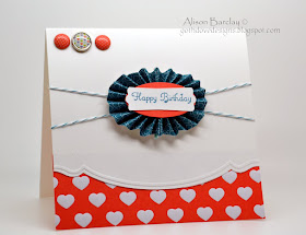
Anyhoo....here they are.....made using the Sweet Shop Specialty Designer Series Paper, the new Jelly Bean brads (YUM!), the In Colors Bakers Twine and the curved Adorning Accent Edgelit die on both the card and the rosette edge.

TIP - When you are 'pulling' your rosette into shape, experiment a little with the tension on the bakers twine...this will influence the shape of your oval. As you can see from the cards below, the first card is quite a defined elliptical shape, whereas the second card is looser and more of a vertical oval.


I hope you have enjoyed visiting today.....feel free to email me if you have any questions about my projects or if you want to place your Autumn/Winter Mini order or have a catalogue sent out to you. My card recipes are below....

Your next blog hop destination is the delightful
Keryn Campbell!!

Materials used
Card 1:
Stamps - Friendly Phrases
Ink - Basic Gray
Cardstock - Whisper White, Twitterpated DSP, Basic Grey CS, Pear Pizzazz CS
Accessories - Twitterpated Designer Buttons, Linen Thread, Pear Pizzazz Pleated Satin Ribbon
Tools - Adorning Accents Edgelit die, Simply Scored, Heart to Heart punch, Textured Impressions Embossing Folders - Adorning Accents (for hearts on heart punch), Sticky Strip, Paper Snips, SNAIL, Paper cutter

Card 2:
Stamps - Friendly Phrases
Ink - Riding Hood Red
Cardstock - Whisper White, Twitterpated DSP, Riding Hood Red CS
Accessories - Twitterpated Designer Buttons, White Bakers Twine, Riding Hood Red Pleated Satin Ribbon
Tools - Adorning Accents Edgelit die, Simply Scored, Boho Blossom punch, Sticky Strip, Paper Snips, SNAIL, Paper cutter

Card 3:
Stamps - Create A Cupcake (sentiment)
Ink - Island Indigo
Cardstock - Sweet Shop Specialty Designer Series Paper, Whisper White, Calypso Coral CS
Accessories - Island Indigo Bakers Twine, Jelly Bean Brad, In Color Printed Designer Brads (Calypso Coral)
Tools - Simply Scored, Adorning Accents Edgelit die and embossing folder, Modern Label Punch (altered), Large Oval Punch, Sticky Strip, SNAIL, Paper Snips, Paper Cutter.

Card 4:
Stamps - Create A Cupcake (sentiment)
Ink - Wisteria Wonder
Cardstock - Sweet Shop Specialty Designer Series Paper, Whisper White, Lucky Limeade CS
Accessories - Wisteria Wonder Bakers Twine, Jelly Bean Brad, In Color Printed Designer Brads (Wisteria Wonder)
Tools - Simply Scored, Adorning Accents Edgelit die and embossing folder, Large Oval Punch, Scallop Oval Punch, Sticky Strip, SNAIL, Paper snips, Paper Cutter.